Sleepio
Redesigning a decade old product to be more mobile friendly, accessible and relatable for a modern audience.
Context: Sleepio is a digital treatment for people struggling with insomnia. Unlike other programs, Sleepio uses evidence-based techniques to get to the root of the problem and provides lasting results. Users are given short pieces of content in the form of: animated videos, text modals, quizzes and audio sequences to provide them with psycho-education and techniques on how to improve their sleep.
Problem: Being a decade-old product, the program relied heavily on web/desktop and also featured a character who was not culturally responsive with our audience.
Company: Big Health
Role: Art Director, Illustrator, Storyboard artist
Our Solution: Our goal was to do a complete redesign of both content and visual design so that the product was more accessible, mobile-friendly and relatable to a modern audience.
I led the visual redesign of characters, colors and backgrounds and worked with content designers and animators to revamp our scripts and in-app videos
Outcome
Sleepio is now an FDA cleared digital treatment
In a clinical trial, 76% of users experienced clinically significant improvements in insomnia
54% reduction in time to fall asleep
62% less time awake at night
45% better functioning the next day
Sleepio Improve Program
I worked with the content designer and animator to script, storyboard and then worked with animators to create our brand new welcome intro to the program. This is the very first video users see upon starting Sleepio and gives them a glimpse into what to expect throughout the next 6 weeks.
In addition to our animated videos, I illustrated all spot illustrations and worked with our animator to create gifs that would accompany text-based modals. By providing our users with a range of bite-sized content, we aimed to increase retention and keep users coming back to the program.
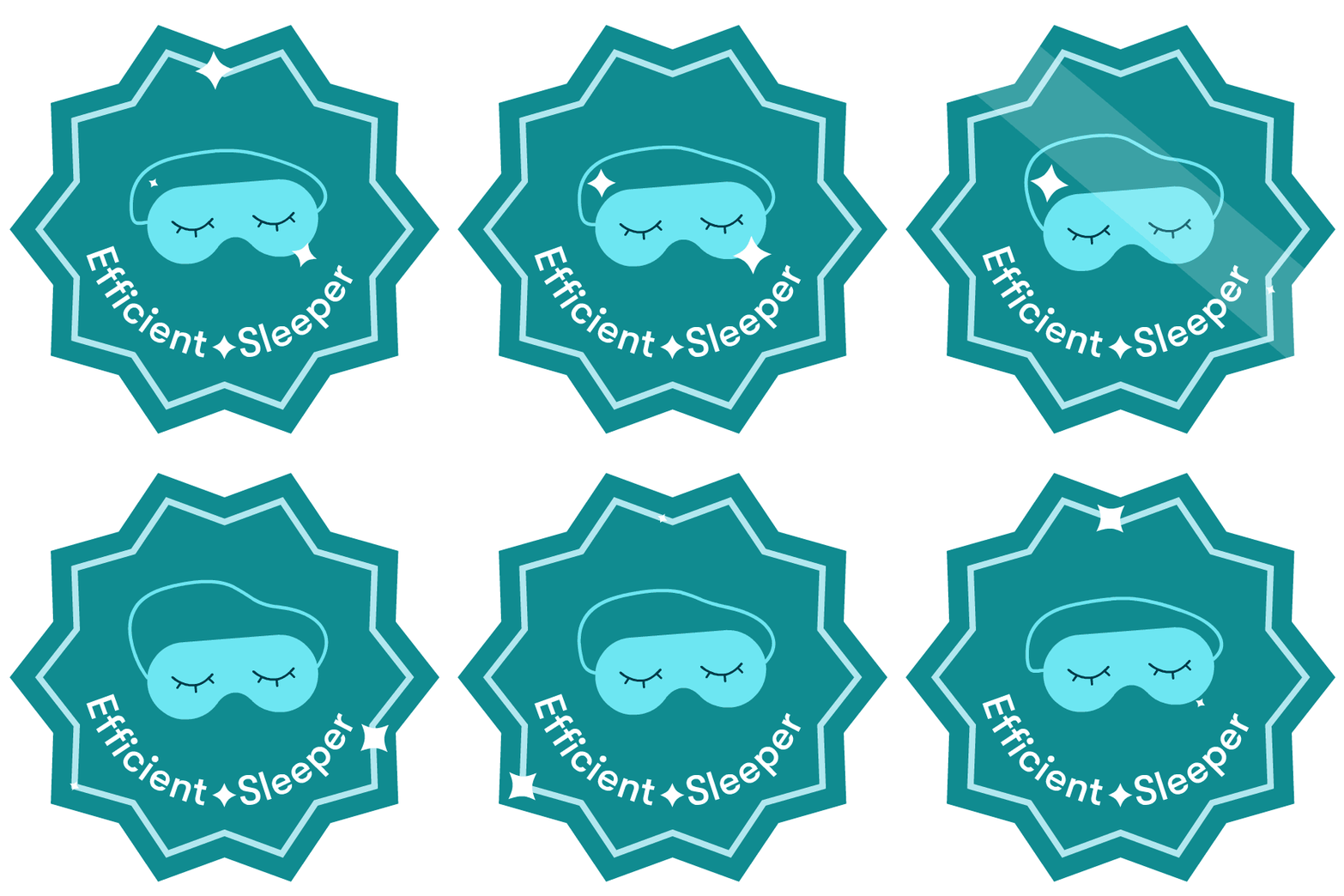
Award badges for users after completing specific goals:
From the get-go, we knew we wanted to update the characters and voice of the program. The current Sleepio featured a guide named “The Prof” and his trusty sidekick, “Pavlov”. While a white, male and Scottish character may have worked in the past, now it seemed un-relatable and outdated.
We took past research that was done on the general demographic of our users and workshopped some of our core values to inform how we wanted our product to look and feel.
Gather research, information and inspiration
PREVIOUS STYLE & CHARACTER MASCOTS
Product Goals
Sleepio should remain inclusive, culturally responsive and modern while maintaining the right position between serious and fun.
User Goals
Users should feel calm, supported, and motivated. They should feel as though they’re in expert hands.
Visual Goals
Characters should reflect the voice of the user, not a figure of authority. Feature a cast of characters that reflects the diverse users of Sleepio.
Our character “Emo” worked well in our other product, Daylight, which was used to treat generalized anxiety. The combination of their minimal design & simplicity worked well to reflect the general user.
Using "Emo” as a base, we began playing around with shapes, color and stroke to create our new cast of characters
Concepting
We gathered reference images that worked well with our vision: simple colors, shapes and less humanoid characters
Then I took the main foundations of our core set of principles and began playing around with different shapes and colors.
There needed to be a balance between being fun yet serious, relatable and accessible. We wanted the characters to feel welcoming and approachable.
After weeks of concepting, we arrived at our new characters. The mix of curves and sharp angles combined with the overall simplicity of form was a natural evolution, or ‘emo-lution’, from our original character. We conducted some user research to test our new characters and content, which yielded positive results, with users saying the characters felt “new and refreshing”.
Now that we had our characters, it was time to implement them into our content.
Credits
Company: Big Health
Creative Direction: Neil Simpson
Art Direction: Catherine Song
Content: Elise Vierra, Alisa Katz, Karen Chu
Design: Jess Kemp, Caroline Wong


