Everfi Adult Financial Education
Updating the visual style for a financial literacy product to better align with our core adult learners
Company: Everfi
Role: Illustrator, Visual Designer, Motion Designer
Context: Everfi’s financial education courses aim to provide 2.7 million adult learners build a strong foundation by offering courses focused on topics like saving for a retirement, budgeting and credit management. Used by over 600 institutions, the courses are Everfi’s top selling financial education product.
Problem: Despite being one of our core products, declining renewals indicated that the visual brand was in need of a redesign in order to better suit our audience.
Our Solution: Our focus was to move away from previous cute and bubbly imagery and transform the visuals into something cleaner, simpler and more editorial to help learners focus on the educational content.
Outcome
• 2.5% increase in both sales and contract renewals with financial institutions
• Improved readability with more focused content & minimalist visuals
• Better accessibility by catering to a global audience
Creating a bridge between users and clients
The Problem
Quality + Optimization for Mobile
The need to offer engaging content aligned to real financial goals and questions
Brand Flexibility + Consistency
The need to be flexible so that illustration style complements the clients’ brand, ensuring seamless integration as content is delivered through client’s sites
Solutions
Minimal Design Style
Develop a minimal style that enhances layout and breathability while reinforcing content
Visual Elements
Create hierarchy of illustration assets (icon, XS, illustration) for flexibility and brand consistency
Identifying Gaps to Improve the Illustration Style
As the visual designer/illustrator, I condensed our illustration redesign approach to these core pillars:
Color brings emotion and
clarity to imagery
A revamped color palette with bolder contrasts improves readability and visual interest.
A ➡️ C thinking
Adopt a editorial illustration approach that offers a more mature visual experience, reinforcing learning and improving user engagement through visual storytelling.
DEI
Representation of diversity and inclusion through the different skintones while removing previous cute/bubbly characters to allow for cleaner readability and visuals.
Accessibility
Complex scenes are simplified with single-color backgrounds, while decorative elements that don’t support learning are removed.
Color Palette
The previous palette was created around 2022 when illustrations became a bigger focus within the product, however, there was a lack of research used to inform the visual design approach due to time constraints.
The new color palette uses a wide range of fresh, vibrants colors to cater to our modern audience comprised of young adults to retirees, while also allowing for flexibility for our partner financial clients
With the new palette, alll illustrations also maintained at least a AA WCAG compliance level

Before: Original style used across product summarizing the idea of 'key points'

After: A brighter, minimal approach to the same idea of 'key points' using a more editorial approach
The Works
A library of all the fun illustrations/animations I worked on throughout this project
XS Illustrations formatted for smaller scale spot illustrations:
Icons used across desktop & mobile:
Various Use Cases:
As a visual designer, I collaborated with product design/UX teams to create a variety of visual assets, here are some of my favorites:
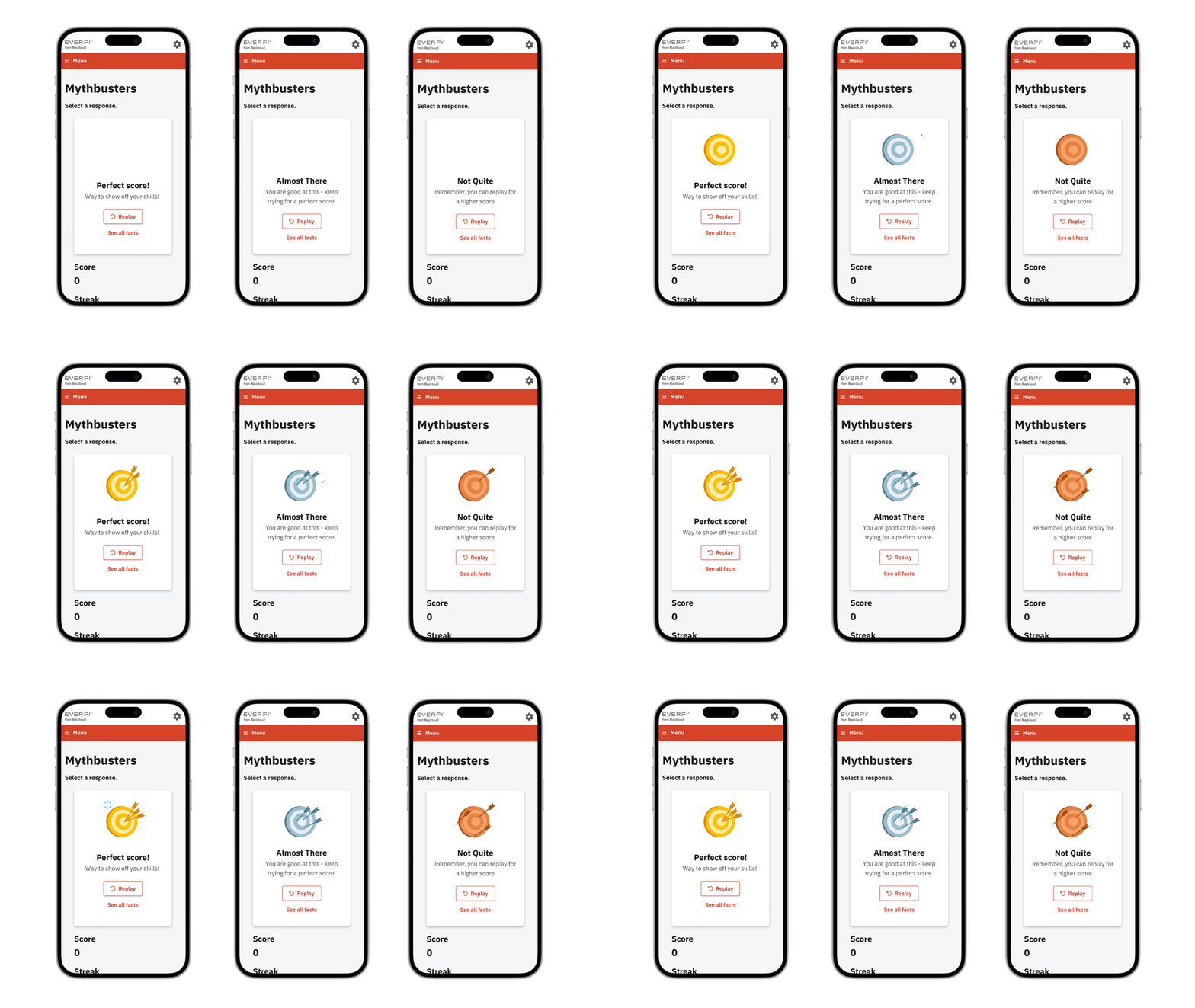
Interactive animations for a card game
Illustrations for an interactive budgeting tool (images 1 & 2 created by Kasey Albano)
Illustrations and animation on a course teaching kids how to budget
Illustrations for an article about social security
Illustration about how the elections may affect the economic market
Team
Product Manager: Scott Beck
Project Manager: Julie Libman
Product Design Director: Ann Schoew
Product Design: Jason Reyna, Madeline Stoltz, Jeff Battocletti
Illustration/Animation: Catherine Song, Grace Manno, Kasey Albano, Roscoe Rappaport, David Pietrandea
Content: Heather Leppin, Shannon Taylor, Manal Abaya, Miriam Greenwald
Developers: Senu George, Luiz Costa, Carlos Zepeda, Selin Sahin, Andrea Crisan


